One product. Connected workflows. A shared design language.
Bringing people, performance and finance into a more coherent workplace experience.
A closer look at the work.
SelamNew Workspace spans employee administration, recruitment, attendance, performance management, learning, compensation and payroll. Its complexity is not only in the number of modules, but in their relationships.
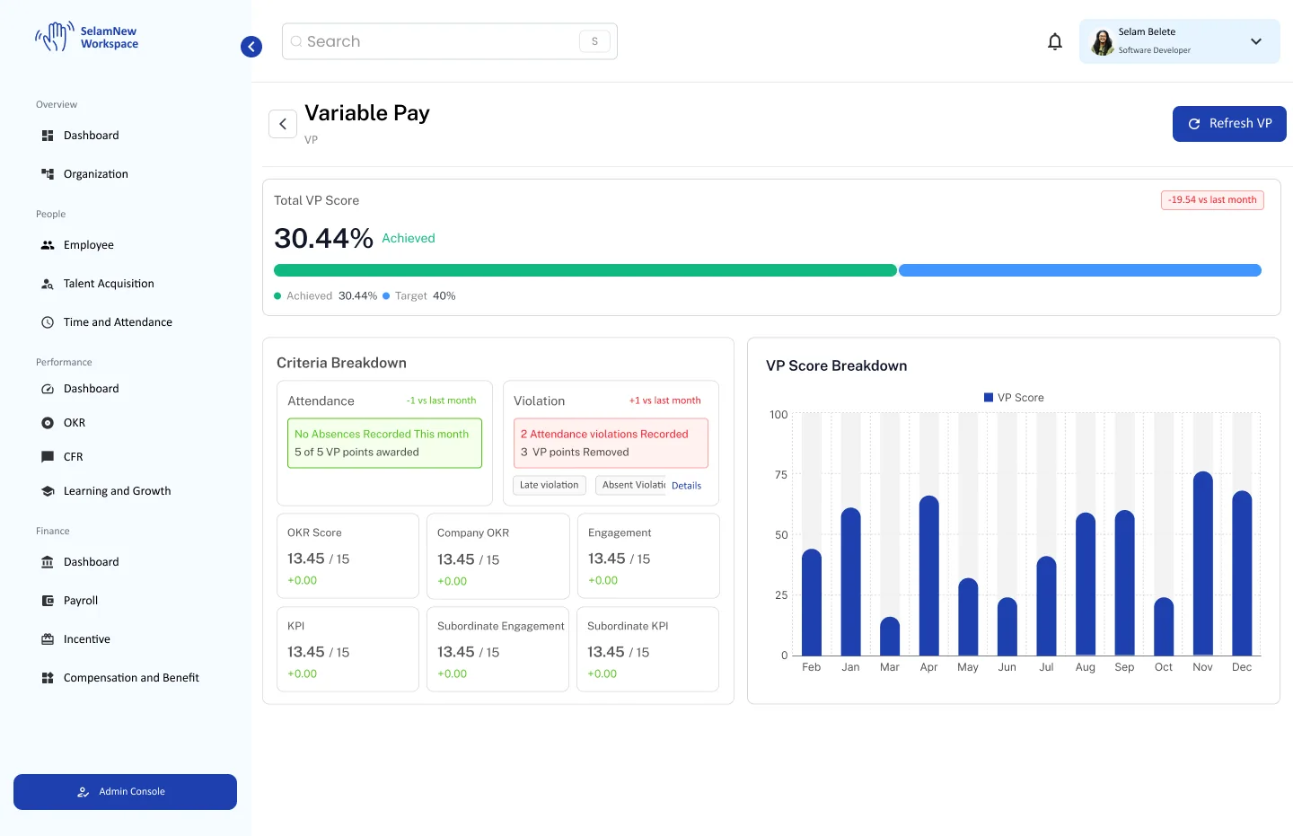
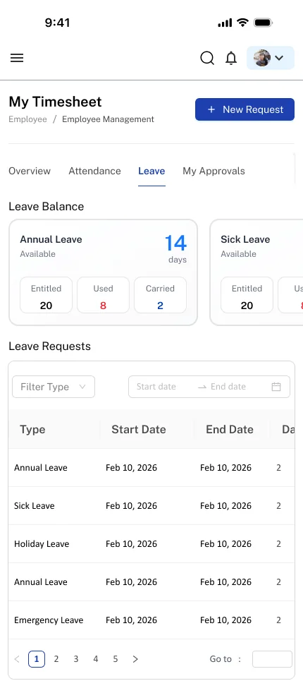
A leave request changes availability. An attendance exception can influence deductions. A performance criterion may contribute to variable pay. The design challenge was to make those connections understandable while keeping the rules each workflow requires.
Complexity lived between the screens.
Different responsibilities expose different information, permissions and consequences. People need consistent patterns for where to act, what statuses mean, and what happens next.
The material includes dense onboarding forms, complex OKR setup, and collaborative review notes about unclear actions and terminology. These are design-review observations, not verified user-interview quotations.
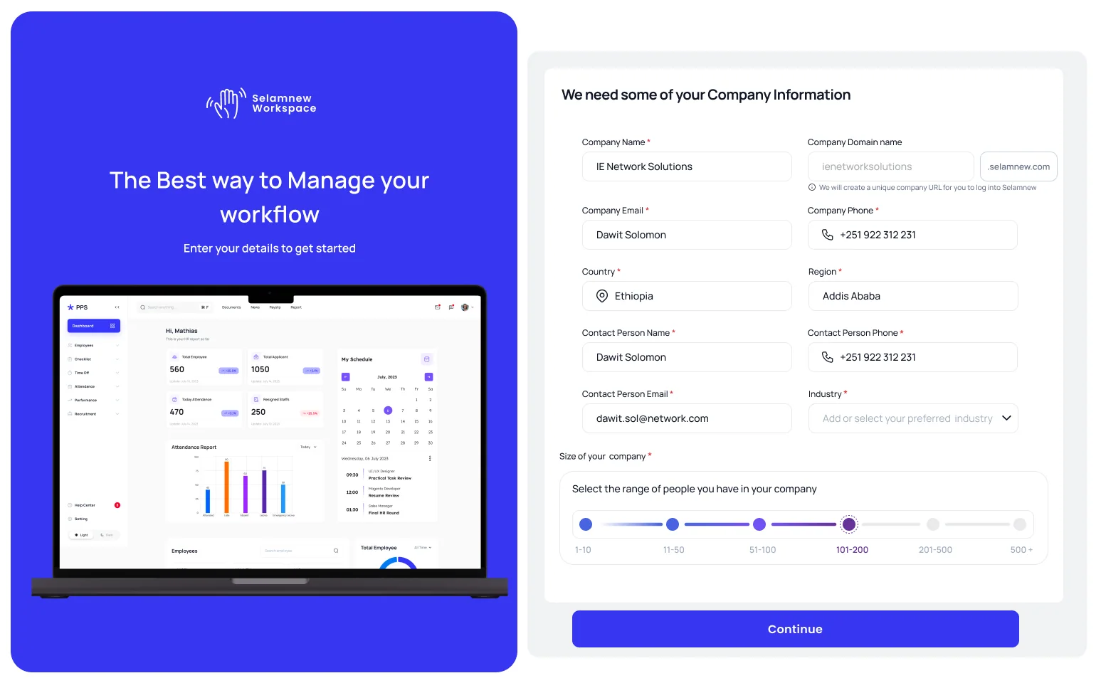
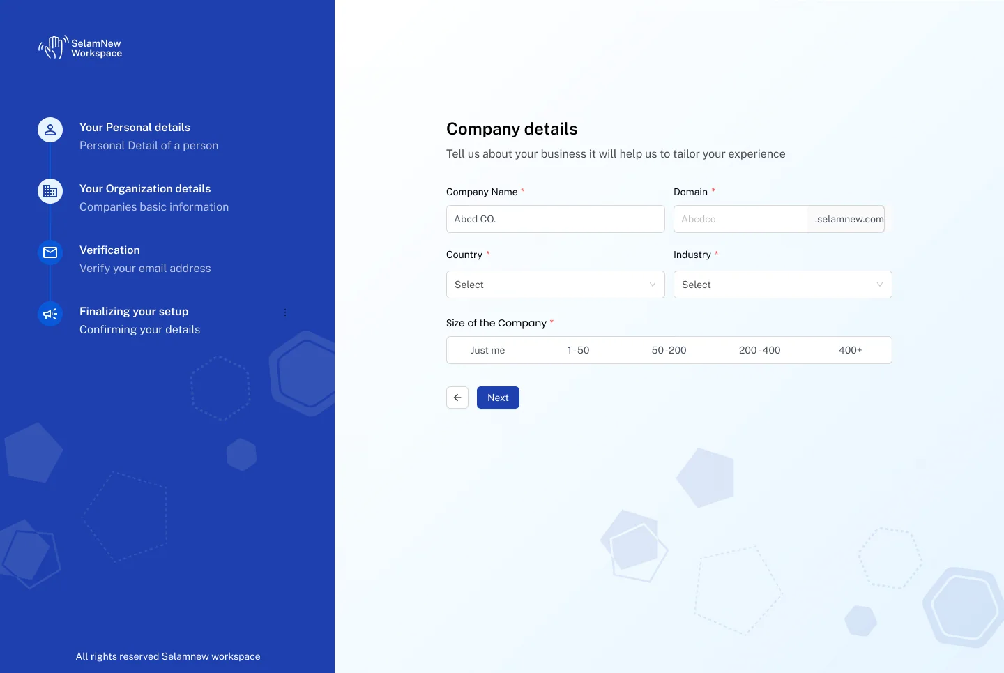
Make the next decision obvious.
Exploration included comparative OKR references, workflow modeling, and iterative collaborative reviews. Formal interview counts and usability-study outcomes are not established by the accessible evidence.
OKR review feedback suggested selecting the metric type before revealing its configuration, and collapsing an existing key result to a concise summary until editing is needed.
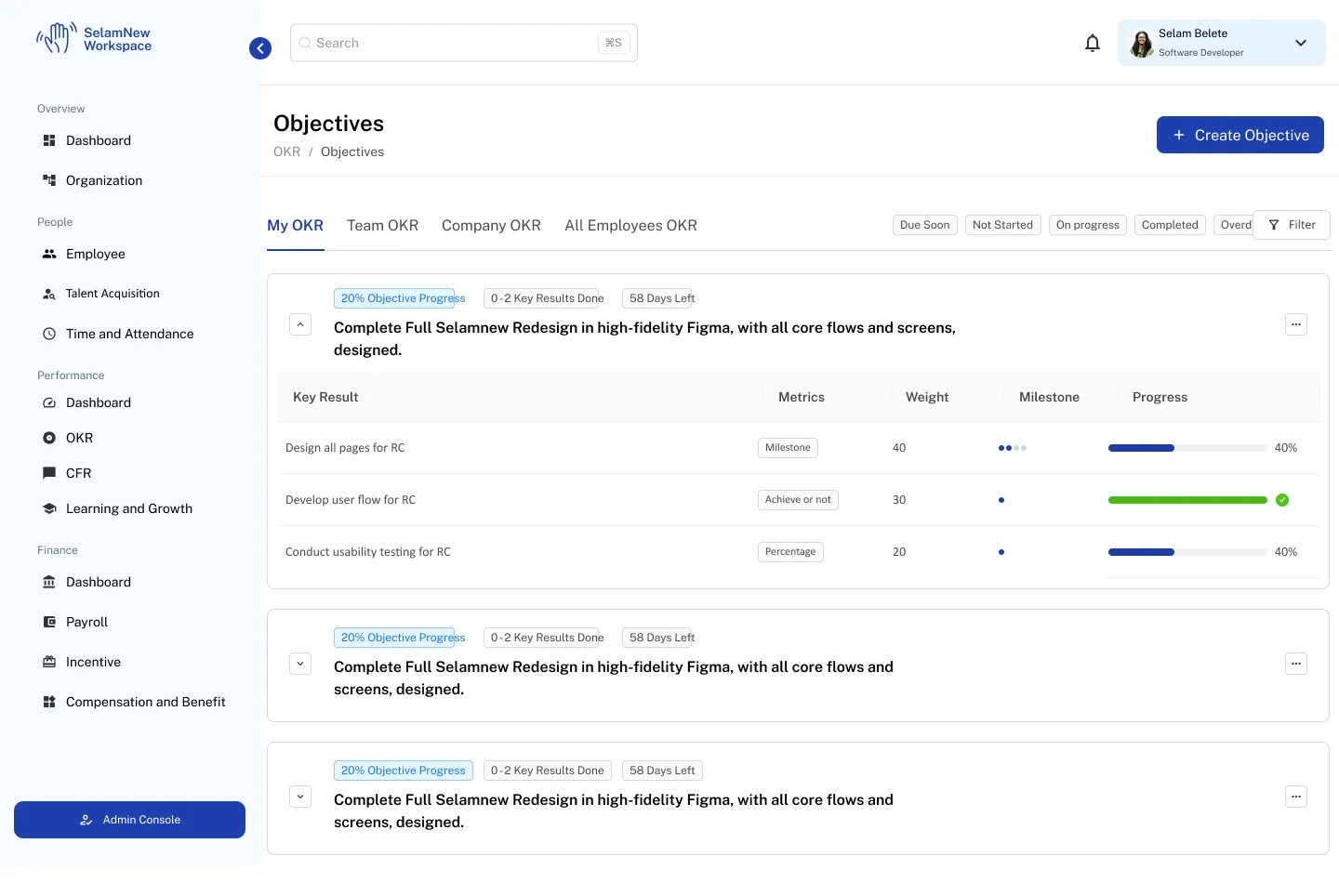
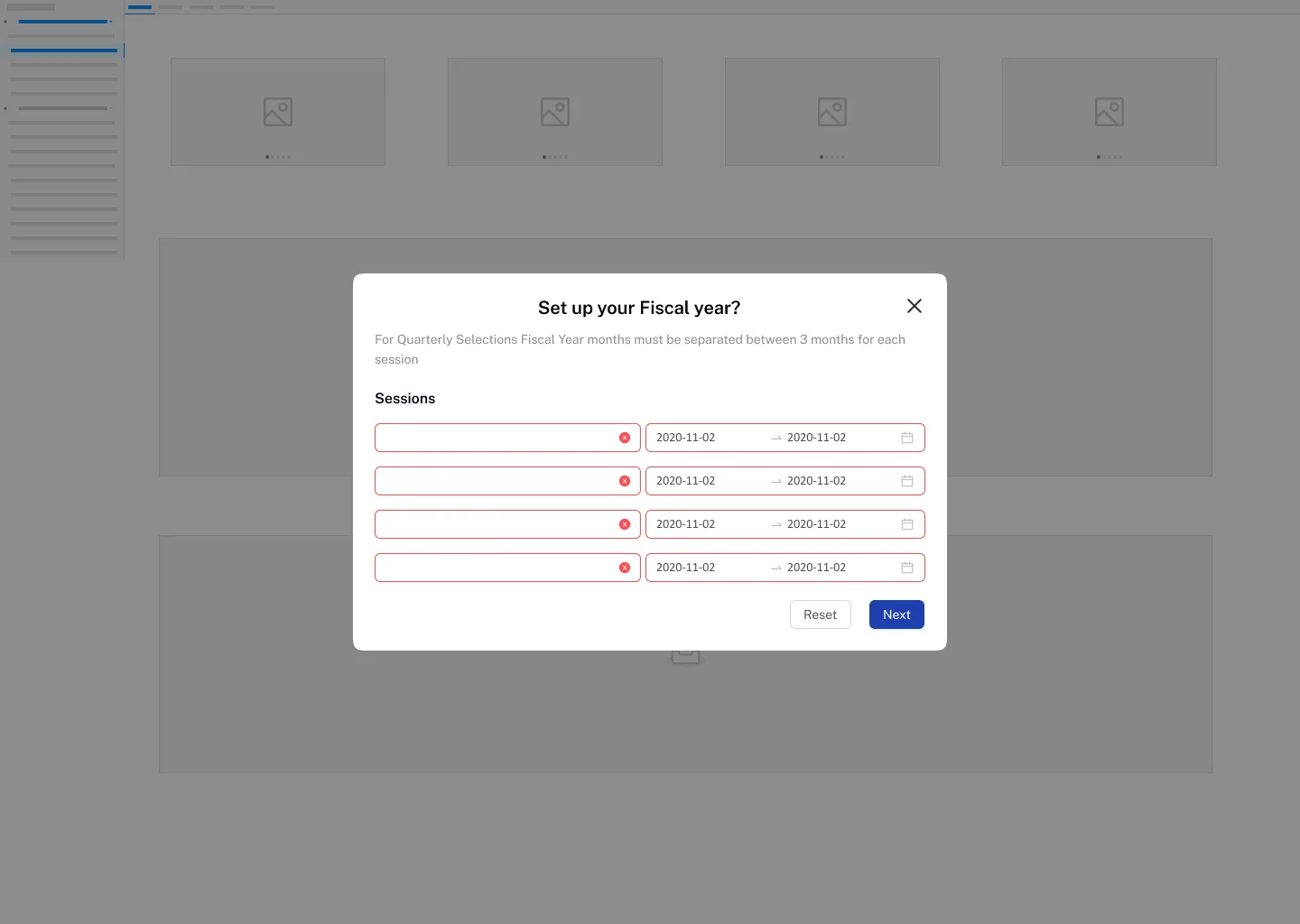
Standardize patterns without flattening business logic.
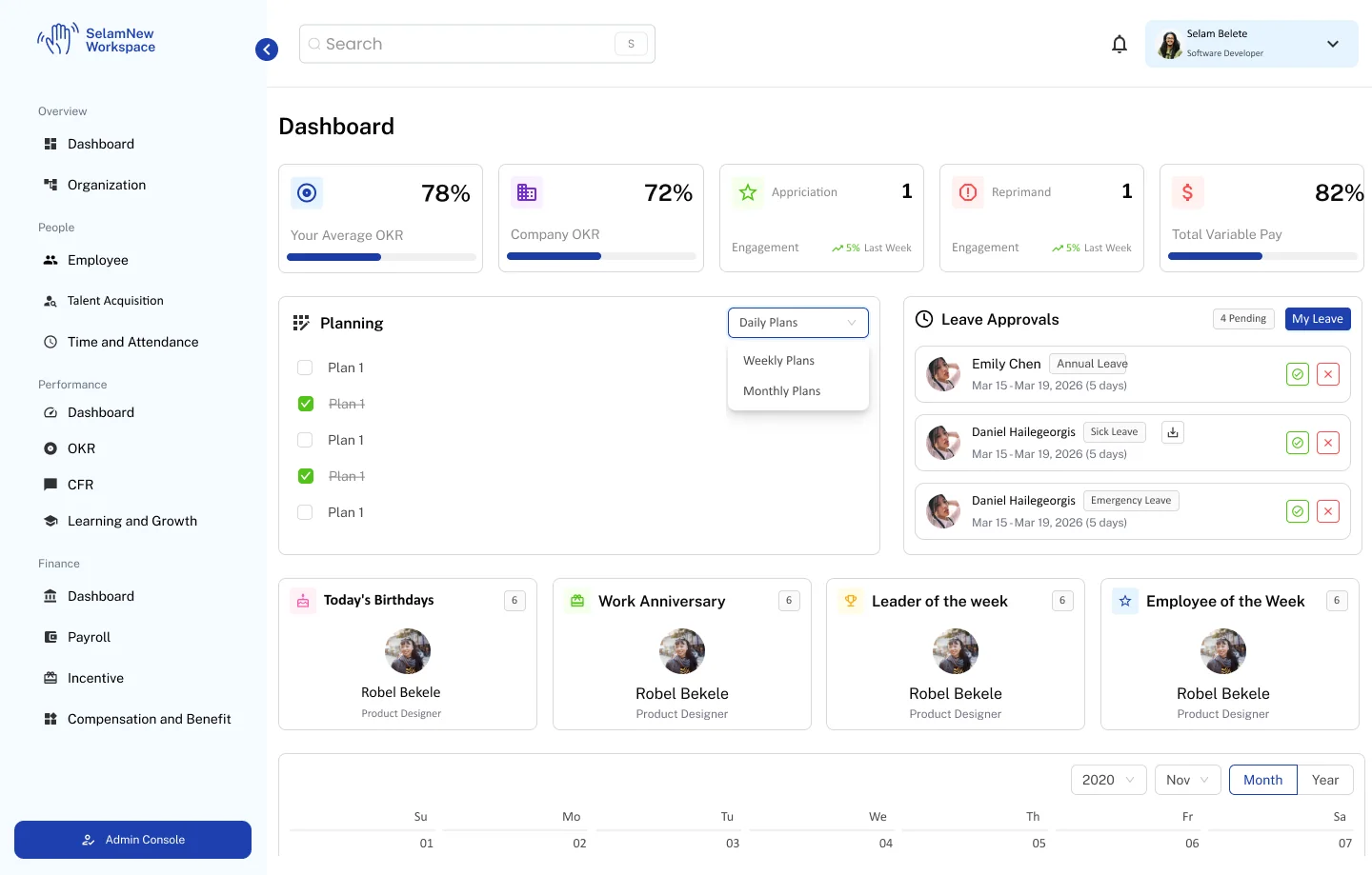
A common navigation language groups the platform around Overview, People, Performance and Finance. Similar interaction patterns recur in searches, headers, filters, approvals and confirmations.
Employee and administrative perspectives are intentionally different: My OKR vs team OKRs; personal timesheets vs employee attendance; personal payroll vs payroll operations.
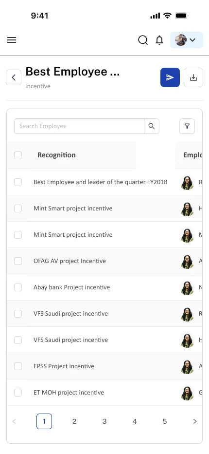
This approach prioritizes connected journeys—attendance to deductions, recognition to payroll, and objectives to planning—rather than presenting each module as an isolated feature.
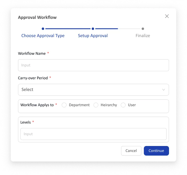
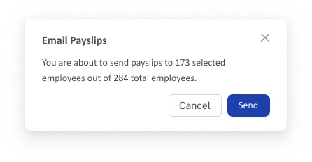
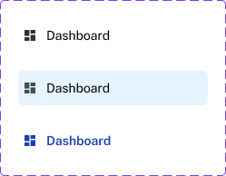
Consistency is behavior, not just appearance.
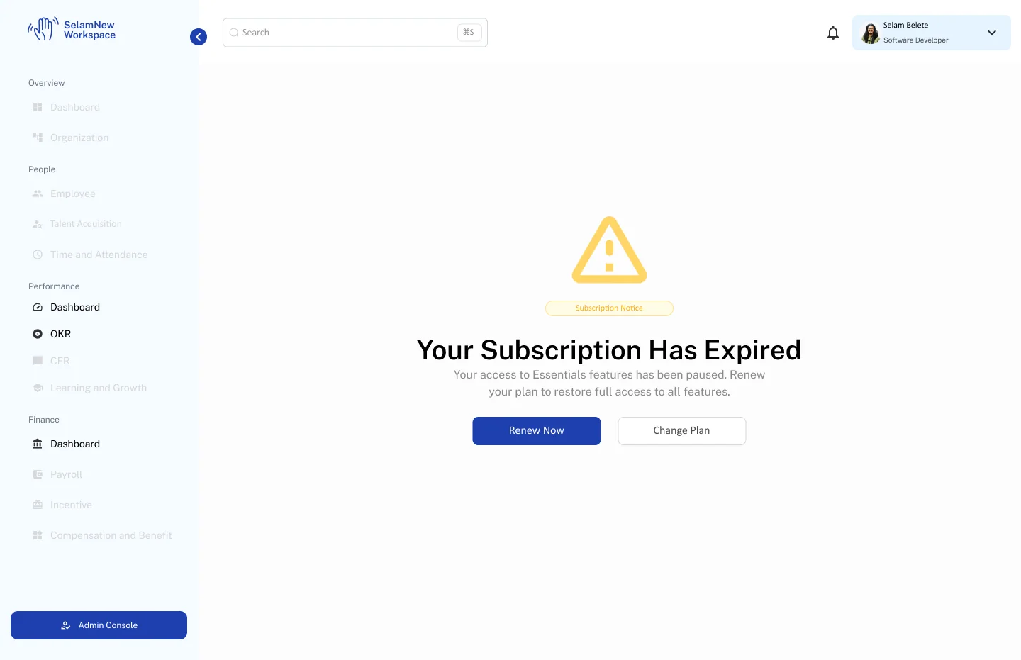
Shared components cover navigation states, filters, dialogs, cards and specialized structures. Error, empty, expired-subscription and destructive-action states make the work more credible than a happy-path-only collection.
Responsive patterns carry across desktop and mobile, although wide data tables still require task-specific adaptation and testing. A shared component language is demonstrated; complete token governance and accessibility compliance are not independently verified.

The next measure is operational confidence.
The file demonstrates comprehensive workflow coverage, repeated design patterns, mobile adaptations and high-impact decision states. It does not independently verify published figures for users, engagement or satisfaction.
Post-release measurement should establish task completion, error frequency, approval turnaround, corrections and user understanding. Do not present the reported 40% engagement or 30% satisfaction improvements as validated results without a baseline, measurement window and source.
What I would improve next.
Test full journeys across departments rather than isolated screens; revisit horizontally dense mobile tables; make compensation rules and deduction calculations explainable.
Resolve naming and policy inconsistencies, formalize reusable semantic tokens, document accessibility behavior, and define metrics before the next release.
The difficult work sits between dashboards: translating policy into understandable actions and making specialized workflows feel like one product.
The linked Figma material demonstrates designs and collaborative review, not independently confirmed production outcomes. Confirm individual ownership, collaborators, release status, permission to share, and numerical claims before publication.